Creative Lettering
In the Art Studio, we often encourage guests of all ages to explore the combination of words and images. We’ve facilitated storytelling through bookmaking, used words to inspire artmaking, and our drop-in art program is currently centered on combining drawing with collage to celebrate the alphabet.
This past summer, we explored creative lettering in an evening adult workshop where participants played with letter forms, color, and movement.
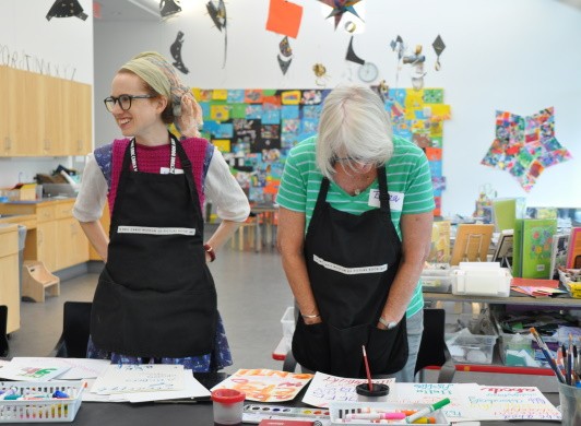
We started the workshop with a warm-up, painting with liquid watercolor on a large wall surface. Participants were encouraged to engage specific muscle groups and joints to paint lines and make marks on the large watercolor paper. This warm-up not only loosened up our muscles to use in more fine-motor activities later, it also helped participants develop their hand-eye coordination and loosen the grip on the drawing tool. We discussed how fatigue and cramping can develop from an overuse of certain muscles, so warming up all the muscle groups and switching between them can help prevent strain.
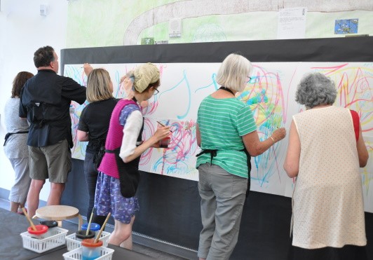
This warm-up activity got everyone thinking about which muscles we most often use to write, (our fingers and wrists) and that the shoulder joint and elbow were best for painting on a large scale.
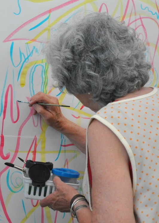
The paint colors, yellow, red, and turquoise, also yielded beautiful mixtures when layered and overlapped.
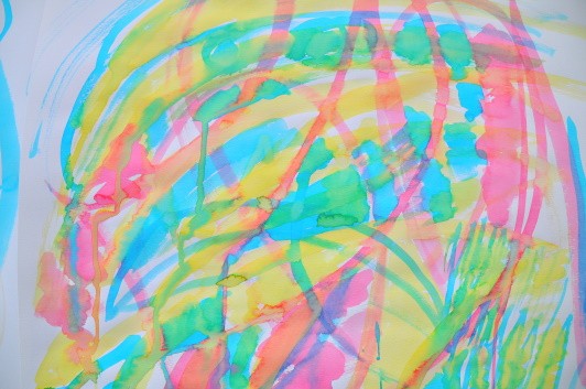
We also explored how pressure changed the weight of the line. When moving upward, we experimented with brushing lightly for a thin line, then on a down stroke pressing harder to yield a thick line. This exercise of varying pressure is a technique used in brush lettering and pointed-nib calligraphy to create letters with distinctive thin upstrokes and thick down strokes.
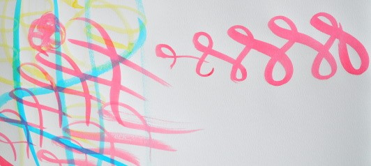
After experimenting on a large scale, we then translated the exploration onto a flat surface. We explored new materials: watercolor palettes, different paper options, and markers.
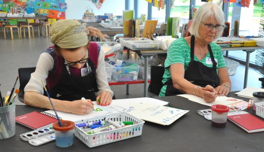
We tested how pressure worked with the markers, and how the watercolor palettes worked differently than the liquid watercolor. We thought about the angle of the paper, drawing tool, and the angle of the table surface and how those angles affect the letters. To encourage exploration, I called out prompts to spark new idea, encouraging letter making that were squat, tall, curvy, robot, slanted etc.
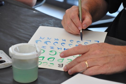
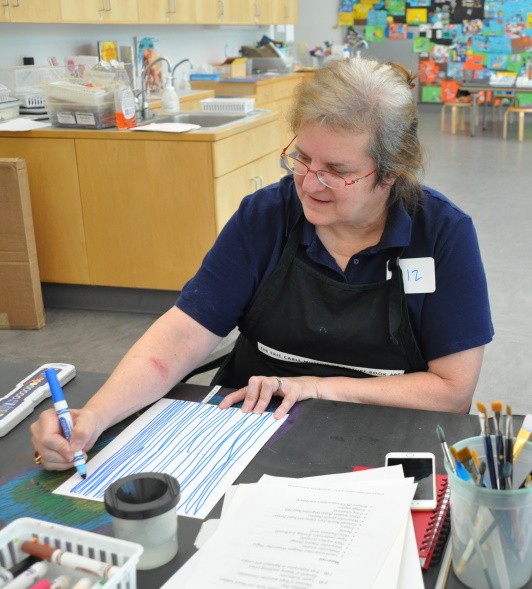
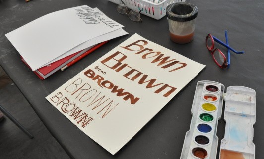
After experimenting with letters on flat surfaces, we then switched to creating letters in 3-D with wire.
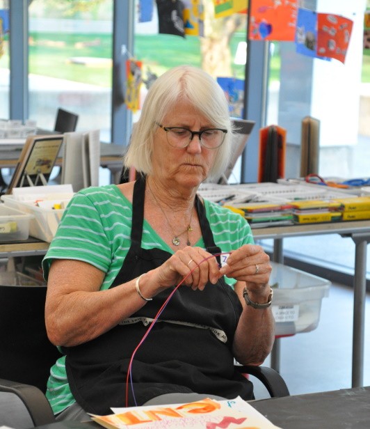
Sculpting letters helped us think about the connections between letters and letter spacing with a limited amount of wire.
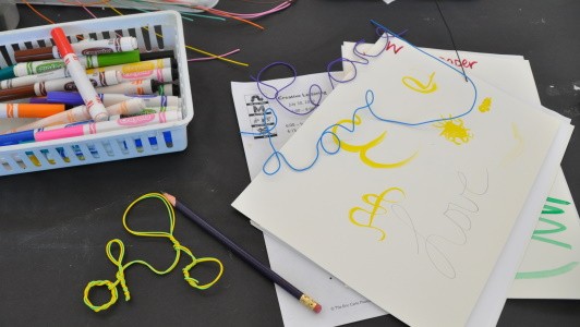
To round out the evening, we had a free exploration of materials to create artwork inspired by letters. Some chose to focus on a single letter, others created phrases, and some combined the two.
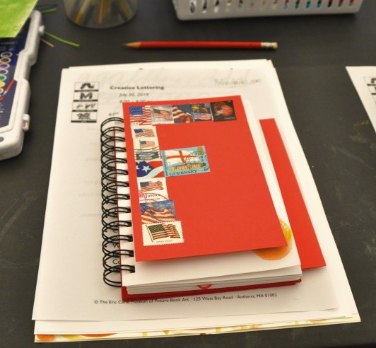
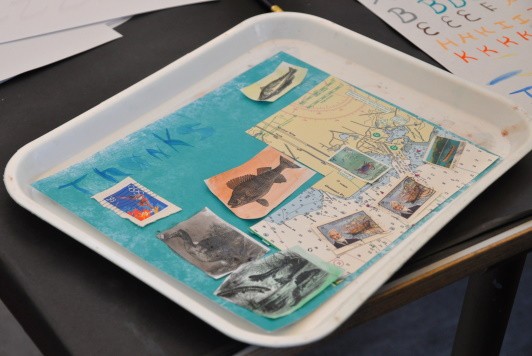
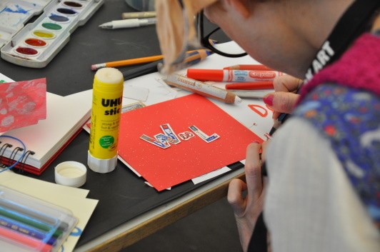
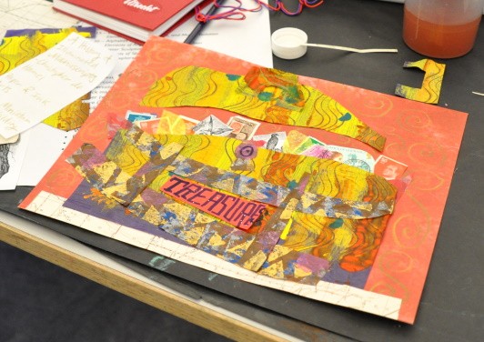
At the end of the evening, participants walked away with their artwork and the Art Studio held onto the large-scale watercolor experimentations.
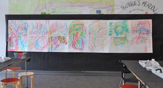
With the beautiful swoops, dashes, and lines, we were inspired to cut them up and turned them into cards.
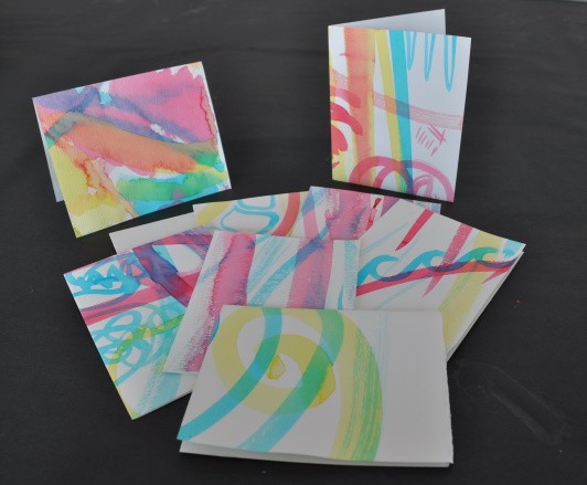
So the papers will have a second life, holding hand-written notes from the Art Studio.
