
Brendan Wenzel, Illustration for Inside Cat (Chronicle Books). Collection of Brendan Wenzel. © 2021 Brendan Wenzel.
Pretty, Witty, Sly, and Sublime
In 2023, Dr. Jonda C. McNair, a professor of children’s literature at Ohio State University, opened a lecture at the Eric Carle Museum by observing, “When I think about a picture book, I think of it as an art object.” McNair wasn’t merely urging listeners to take picture books seriously as an artform. She was stressing the importance of appreciating a picture book as a physical whole, and examining how each element, beyond just the central text and art, contributes to the book’s effect. She quoted the late Dr. Lawrence R. Sipe, another children’s literature scholar: “Every part of a picture book is meaningful, from front to back cover. If we simply begin to read where the story begins, without examining its cover, dust jacket, endpages, title page, and other front matter, we miss much meaning.” I would only add that we might also miss much delight.
The title of McNair’s talk (part of the Museum’s annual Barbara Elleman Research Library lecture series) was The End Is Just the Beginning: Examining Endpapers in Picture Books. The Museum’s 2025 exhibit Open + Shut: Celebrating the Art of Endpapers, which I have guest curated, aims to continue this mission of redress, highlighting the thought and creativity illustrators bring to an often-overlooked aspect of bookmaking.
What exactly, some readers may be wondering, are endpapers (also called end pages or end sheets)? In the narrowest sense, they are the pages pasted to a hard-bound book’s inside front and back covers. They serve a practical purpose, binding the rest of the pages to the cover (or “case,” to use the technical publishing term). But for artists and designers, endpapers can also be a gloriously blank canvas.
Just ask Brendan Wenzel, the Caldecott Honor-winning author-illustrator (They All Saw a Cat, A Stone Stood Still). “I’m not the first person to say this,” he notes, “but when you only have thirty-two pages”—the length of a typical picture book—“you want to take advantage of every surface you have for storytelling.” Ryan T. Higgins, creator of the Bruce the Bear and Penelope Rex series, is another enthusiast: “I really like the extra element that endpapers can add to a story. On the rare occasions I am short on pages to tell my story, I can use the endpapers as a way to get more story in the book!”
Thus, a once purely functional medium—sometimes decorative as well, sometimes not—now becomes a forum for wit, surprise, even feeling. Endpapers can tell a story within a larger story; they can frame the main story, suggesting its narrative or even emotional sweep; they can serve as a warm-up act or overture; they can provide background information, almost like a visual forward or epilogue, they can comment on the action or crack a joke. Some do all that at once, and more. Think of end papers as a picture book’s equivalent of a movie or TV show’s title and credits sequences, or, better yet, an amuse-bouche at the start of a meal and a nice little cookie plate at the finish.


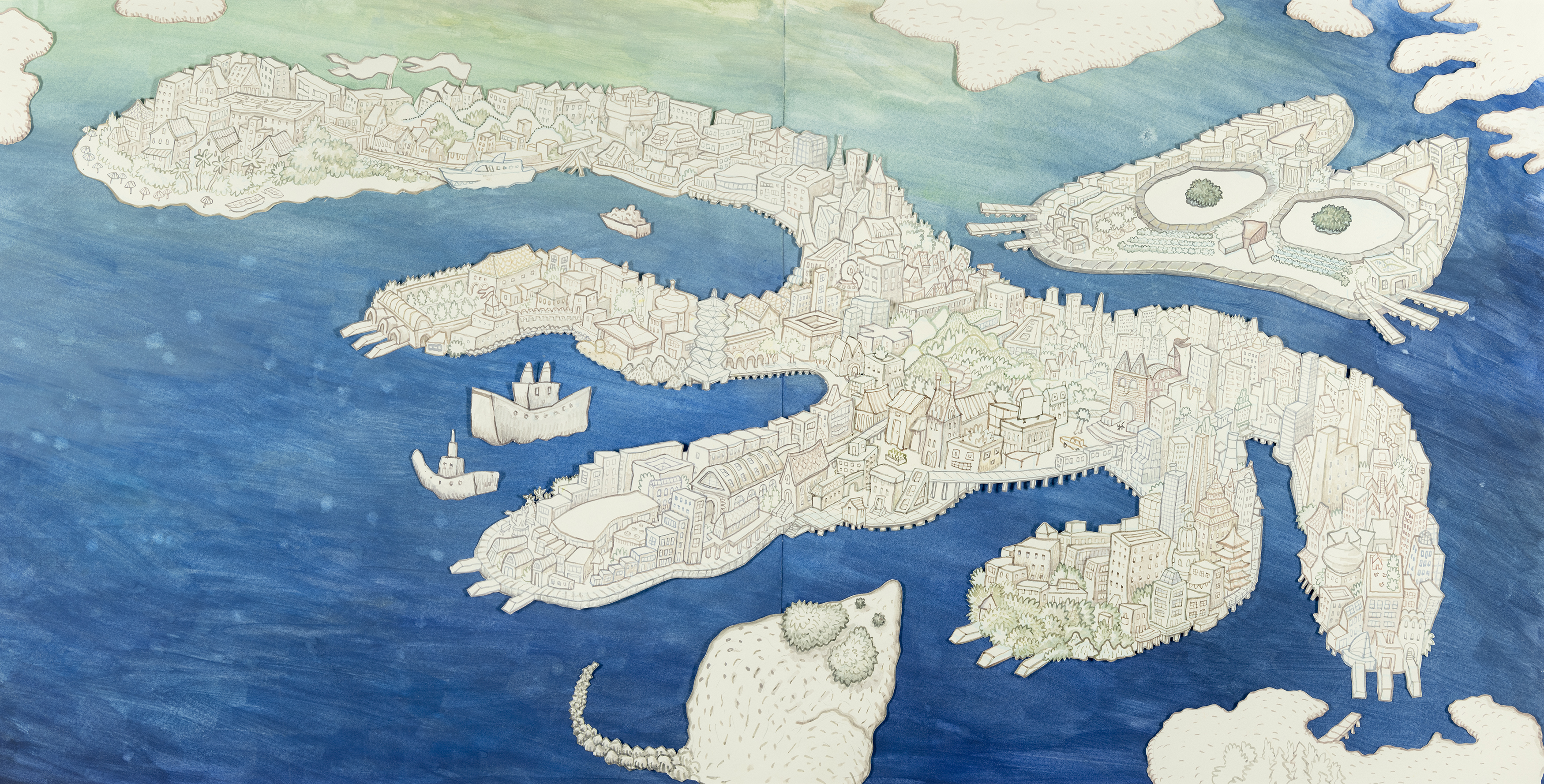
Brendan Wenzel, Illustrations for Inside Cat (Chronicle Books). Collection of Brendan Wenzel. © 2021 Brendan Wenzel.
Take the endpapers for Wenzel’s Inside Cat. The story is about an urban house cat who makes amusingly incorrect assumptions about the city based on the restricted views from its windows. But then, on the book’s last spread, the cat steps outside its front door for the first time and is confronted by the vastness and complexity of the whole wide great big world. Wenzel’s endpapers sum up his cat’s existential quandary with visual puns: the cat as a house on the front endpaper, and as a sprawling urban landscape on the back (ignoring the mouse-shaped island in its harbor). Broadly speaking, the endpapers tell the same story of Inside Cat, but in their own language, distinct from the rest of the book’s.
“What I love about endpapers are that they are both part of the book and not part of the book,” says author-illustrator Shaun Tan (The Lost Thing, The Arrival). “I like to think of them as ‘little dreams’ that hold the story like a set of parentheses or quotation marks.” Tan seconds the comparison of endpapers to movie and TV credit sequences, “the best of which,” he adds, “represent an abstracted, lyrical version of the story universe, sitting quite apart from the style and content of the actual story. They mark a transitional space, a conceptual foyer, between the real world outside and the imaginary world inside.”

Shaun Tan, Illustration for The Arrival (Arthur A. Levine Books). Proposed gift of the artist. © 2007 Shaun Tan.
Tan’s graphic novel The Arrival is a surreal story about immigration. But though it often feels like a dream, it grew out of the experiences of real people throughout history and across the globe. The endpapers remind us of that: they’re based on passport-style photos taken of actual immigrants arriving at Ellis Island, in New York, and other ports around the world, pictures that Tan has collected over the years. “My main intention was to give a sense of human diversity, people of different backgrounds and historical periods,” he says. “Each face could be the subject of a whole other book. As an interesting side note, my father, who immigrated to Australia from Malaysia in 1960, at the age of twenty, features as one of the faces in this series.”


Julie Flett, Illustrations for Birdsong (Greystone Kids). Collection of the artist. © 2019 Julie Flett.
Julie Flett’s endpapers for Birdsong, while just as personal as Tan’s, are more allusive. The book, which Flett wrote and illustrated, explores the friendship between a young girl, Katherina (who has moved to a new house with her single mom) and an older woman, Agnes (an artist who lives on the other side of a big field from Katherina). The endpapers, depicting birds in flight over a meadow, imply the space between the two characters but also their bond–the book’s physical and emotional landscapes.
“Katherina and Agnes share their love of art, the land, and the creatures around them,” Flett notes. “In the story, when they were apart, I imagined them looking up from separate projects they were working on to hear the sound of a wood thrush or chickadees and thinking of each other.” That was inspired by a phone call she once received from her son, who was staying on Gabriola Island, off the coast of a site in British Columbia, where Flett lives. “He was visiting a friend there one summer and he wanted me to hear the sounds of the frogs on the island and held the phone out so I could hear them. That’s the sort of connection I saw between Agnes and Katherina. The endpapers speak to that part of the story, something unspoken but felt.”
If I may return to movie metaphors, Wenzel, Tan, Flett and the other artists represented in Open + Shut are using endpapers the way filmmakers use music, sound design, costuming, and the other lesser sung tools of that craft: to affect readers in ways that transcend straightforward narrative.

Endpapers from The Song of Robin Hood illustrated by Virginia Lee Burton and compiled by Anne Malcolmson, 1947. Collection of the BERL Picture Book Archive, The Eric Carle Museum of Picture Book Art.
This wasn’t always the case. In the earliest days of commercial bookmaking, if endpapers weren’t simply blank—as in many instances they still are today (often for commercial considerations, and because not all illustrators are as enamored of endpapers as those in this exhibition)—they tended to be decorative. One style that became popular in the eighteenth and nineteenth centuries was marbling, a technique that involved floating colored inks on water or some other liquid base and then pressing the swirly, blobby results to paper. (Note to baby boomers: the psychedelic “light shows” in the 1960s utilized a similar process along with overhead projectors. Note to marbling devotees: The University of Washington has digitized its entire collection of marbled papers, categorizing patterns and noting their origins.) Advances in printing enabled more deliberate and patterned designs, often likened to wallpapers, sometimes with themes related to the book, sometimes just pretty or arresting.
As children’s publishing came into its own in the late nineteenth century, bookmakers and artists began to take advantage of this tempting canvas. Prominent illustrators of the early twentieth century like N.C. Wyeth, Maxfield Parrish, and Willy Pogany used endpapers almost as alternative covers, with eye-catching drawings and sometimes paintings that portrayed central characters or scene-setting landscapes. Other illustrators (and/or art directors) employed endpapers to provide background information for a story—maps, for instance, in the case of early editions of Frank L. Baum’s Oz books and, later, C.S. Lewis’s Narnia series. (The endpapers for an early edition of the first Oz sequel, The Land of Oz, mixed artwork with photos of actors from Baum’s well-received stage production of The Wizard of Oz—cross promotion before that was a marketing term of art!)
In the second half of the twentieth century, advances in printing techniques and digital technology made full color endpapers a far more economical proposition, leading to an explosion of creativity that Open + Shut can only scratch the surface of. Please, go browse your local library or bookstore and see for yourself.
Some contemporary artists have kept one eye on older traditions. “When I was a child, I remember having long moments contemplating endpapers,” says the author-illustrator Paloma Valdivia. “My favorite was one of a map, which I would trace with my little index finger, crossing bridges, forests, and paths, bathing in the river before entering the story.”


Paloma Valdivia, Illustrations for Book of Questions: Selections / Libro de las Preguntas: Selecciones by Pablo Neruda (Enchanted Lion). Collection of the artist. © 2022 Paloma Valdivia.
Valdivia honored her younger self while drawing added inspiration from “ancient maps” for her endpapers for The Book of Questions, a collection of short poems by Pablo Neruda which she illustrated. Her front endpaper presents a stylized vision of creation as a hierarchical, well-ordered place. The world is less tidy—though more interconnected—on the back endpaper, reflecting the probing, gently subversive nature of Neruda’s questions and riddles. (“Why do trees hide the splendor of their roots…Who shouted for joy when the color blue was born?”)
“Just as maps help you locate yourself in the world,” Valdivia adds, “endpapers give you a clue to enter the story. They are a glorious welcome to a new adventure.”


Airlie Anderson, Illustrations for Neither (Little, Brown Books). Collection of the artist. © 2018 Airlie Anderson.
Neither, a parable by author-illustrator Airlie Anderson, is set in the Land of This and That, where everyone is either a blue rabbit or a yellow bird—one or the other. It is not a very welcoming place if you happen to be green and you have not only a beak and feathers but also long ears and a fluffy cottontail. Happily, the story soon shifts to the Land of All, where everyone and every kind is embraced. Riffing in part on older decorative endpapers, Anderson uses pure color and design to reflect her book’s two very different worlds: the front a two-toned, blue and yellow rectilinear design, the back a colorful free-for-all with maybe a hint of old-fashioned marbling.
“The story of Neither suggests graphic storytelling with shapes and colors, and it was fun to realize I could extend the story with that,” Anderson observes. “I think ‘decorative’ sometimes has a pejorative sense—people don’t always appreciate that description. But I love decorative things. Hopefully I’m making art with a capital A, but I would also like to cover everything in fun patterns, too.”
Unlike Wenzel, who says he typically includes endpapers with his initial dummy version of a new book—”They’re something I’m trying to weave in from the start,” he says—Anderson waits until she’s done with the interior of book before even beginning to think about endpapers. “Traveling through the book making process, I always get to know the story more through making it. So when I’m finished painting all these illustrations, I feel like I have a really good understanding of what the story is really about, even more than when I was just writing it. So I love making endpapers. It’s the final flourish of what the story is saying, like a little curtain call.”
The fact that a discussion of endpapers can summon so many metaphors to describe their effect—curtain calls, maps, foyers, overtures, film scores and credit sequences, cookie plates—is a tribute, I believe, to the vitality and wide-open potential of this unique platform. Really, of course, endpapers are their own wonderful, distinct thing, as I hope Open + Shut demonstrates. But I’m going to offer one more metaphor: if the cover of a book is an invitation, endpapers are the buzz of the party as you approach the host’s front door, whether raucous, hushed, convivial, punctuated by laughter. The point being, come on in.
Author’s Note
I would like to thank the entire staff of The Carle for making Open + Shut possible —and for wanting to do it in the first place! But I want to especially thank and acknowledge Isabel Ruiz Cano, the Museum’s Associate Curator, and Rachel Eskridge, Associate Registrar, who not only guided me through the curatorial process but were true partners in the shaping and scope of this exhibition. It would have been a much lesser show without their knowledge, creativity, and inspiration.

